


Built from what was already there.
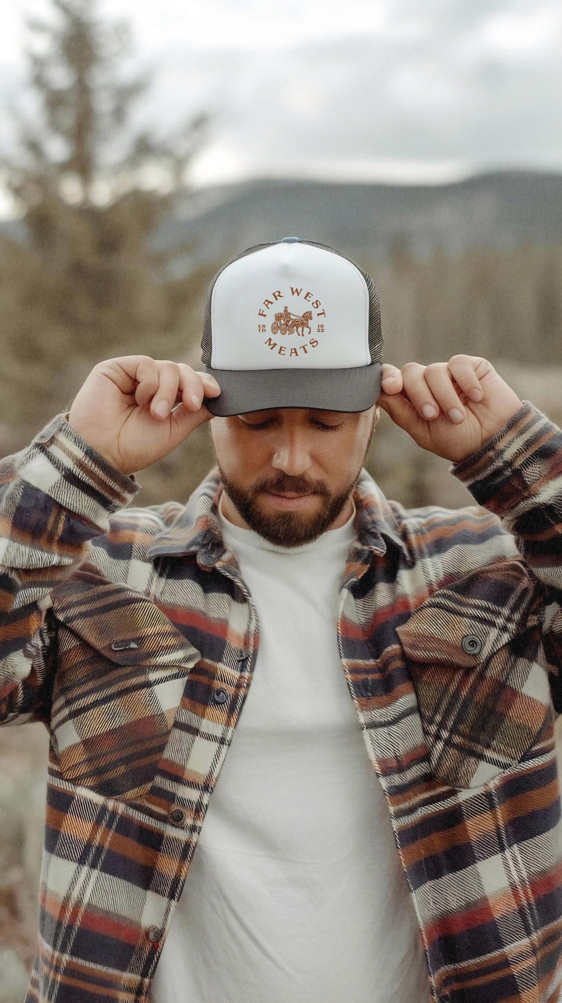
Rather than erase more than 100 years of history, we looked backward to move the brand forward. Heritage typography, a reimagined stagecoach, custom illustration and a warm, California-inspired palette come together in an identity that feels established without feeling stuck in the past.




One brand. A whole lot easier to recognize.
We rebuilt the packaging around a consistent architecture that makes Far West the first thing you recognize and the product the second. Clearer hierarchy, stronger flavor cues and a unified visual system bring consistency across shrink packs and twin packs while giving each product room to stand on its own.


